Wednesday, March 18, 2015

Typography Images


Typography  is the art or technique of arranging  written language to make it readable. Typography can be used with images to make an impact because if you typography you can relate to them. You can also make them think so they see your message. I believe that it is also used to Make a lasting impact in their brain. Typography is also the study of designs in the persons face. I also used it to express who you are to the world and show your inner self through words. Through typography I also think it makes the people be able to see your message.


My biggest problem I challenged in this project was probably copying and pasting the BW picture into the layer mask. I overcame the issue by reading the articles and instructions. Another way I overcame my problem was to ask for help from my peers. The video that I used to do my work helped me a lot because it told me exactly what I needed to do. The article that helped me was an advanced tutorial that helped me with my me picture, Mr. Sanderl my teacher also helped me with all three of my pictures. 


My first picture of  Jonathan Ives  was different from the rest because the words were super tiny. It was Also different because it was black and white. Ms. Nakamura had many colors and some were even my favorite colors. It was different from the rest because it has colors that has the same thing, gradient over layer. My last picture of myself is probably my favorite because each layer has its own color. It is different from the rest  because each layer has a different color. It is also my favorite because it is not all one color like my last 2. It also symbolizes myself as who i am and not who I think I should be. 


Wednesday, February 25, 2015

Double Exposed Portraits


Portrait photography is a photo of a person or a group of people that shows expression or personality of the subject or someone. The focus of the photo is usually the person's face although the entire body and the background may be included. Portrait photography relates to profile view and silhouetting because they all include the outlining of a person and the main focus in all of them is always the persons face. They also all have something to do with of course taking a picture of someone or a group. They are different because silhouetting is the color outlined black of a person, profile view is just a side of one persons face, and portrait photography is a main focus of someones face in the picture.


 To create a double exposures  in photoshop you click on File>Scripts>Load Files Into Stack. Then a screen pops up you will  press browse and choose your photos, Then you press ok. Then you crop your profile and use the dodge tool too make your background white so your image only has your face as color. After that you double-click your layers and press screen mode for all of them. When your done with all of that you can press image and click new adjustment layer and explore and create your double exposure image. Remember avoid happy accidents.You want too make a double exposure because it looks beautiful with all the colors you choose and also because you would probably feel amazing about yourself for creating one.


My symbols are burgers from in and out burgers and Kalalea the mountain. I chose the burgers to represent me because I like to eat food and that was the best burger place I have ever ate at. Kalalea represent me because my great great grandpa died on that mountain and I can see it from my back yard.These are the  the reasons why I chose these pictures. I could have improved by moving the burgers up a little bit in my face. Kalalea could have gone more up like in my neck. 

Saturday, February 14, 2015

HDR Photography


HDR Photography is a method that takes multiple pictures and blends them together to make one amazing photo. In this project we took 7 pictures at different exposures we took the pictures from negative three (-3) to plus three (+3). I like it because it makes my pictures look more awesome and I only have to take 7 to get one amazing photo instead of 12 or more.The thing I don't like about it is that when you have your experiment they might move a lot and  when your in Photoshop they might have ghosting and Photoshop might not get rid of them. It is used for making the picture look like what the eye would see. sometimes the eye sees things that the camera can't see so HDR is there to make the picture look like what you would see.


Here are the six easy steps to creating a great HDR photos. The first step is to: control the exposure from lowest to highest you can do that by locating the plus and minus sign on your camera. The second and third step: is to import your photos and once you are done importing your photos you can organize them in finder then go to Photoshop if you have it. Step 4: Go into Photoshop and scroll over File<Automate< Merge to HDR Pro, then a box will pop up and press browse to find your photos. The fifth step is to : Create a photo that is great with the tools on your right such as vibrancy,shadow, radiance, and etc. The last step is to FOLLOW these steps to get a great HDR Photo. This is very different from the automatic HDR functions because in the automatic HDR functions you press a button and get the final result but with this one you get to do the work and make it your own.

This was the picture I took by the Fire station by Kealia 
In the landscape photo I was trying to get a lot of the sky, ocean, and rocks in the same picture.The horizon line is straight in this picture even though I was taking this picture on gravel. The rule of thirds in this picture is pretty good because the rocks are at the corner of the picture facing the ocean. Then in Photoshop I made it vibrant so the blue and orange sky would be very orange then go into the normal color blue. My thinking for my Experiment photo was that I have my mom stand in middle facing toward the kitchen. I wanted the back round to have the word family and the two pictures my friends mom took. My mom moved very little so it came out pretty cool. The only thing that I probably failed at was the part where you had to make it surreal  she looks the same as she did before except only brighter.
This was the picture I took of my Mom

Thursday, January 22, 2015

Movie Trailer Critque


While we were making the movie poster we were also making a movie trailer. The team that helped me with this project was Alaka'i Gonsalves, Kacie Burns and Kyla Bautista. Our movie trailer was on a boy named Bobby falls a sleep. In his dream he becomes an evil villain that wants to steal the towns most precious Oak Tree. Some other main characters are the agent and his mom. My part was to help to edit, the main person that did a lot of the work was Alaka'i. He took all the time to take the pictures and I think he took around two hundred pictures the second round and five hundred pictures the next time. Another part I did to help my team was take some of the Foley for it.


Some of the requirements were that the trailer had to be 1:30-2:30 seconds long. It also had to have 5 scenes in it; It also had to have a voice actor, our voice actor was Alaka'i. Some others were that it had to have a movie poster. It also needed dialogue, Foley and Text layovers. I completed  all of them; I just barely missed the length one because our movie trailer was 1:31 seconds long. We also took a lot of time during class to do our work but we made it happen and had it meet all the requirements. Although we didn't do something we did others and made it get done.


For the results you had three areas to be graded in. The first area was Audience, most people thought we did really good. Then you have creativity, most people thought we shot for the stars. The next area was Requirements meaning did you have all the things you needed. Yes, I do agree with the class results because we tried our hardest and we may not have included the audience enough or even meet all the requirements but we did our best. I learned how to work together as a team and how to use final cut pro a little more. Now I know that even if you tried your best than to yourself you should feel like you succeed. I also learned that not everyone has the same idea so your plan might not be the plan everyone wants and that you should always communicate what you want to do because other people might like it. In the end I found out that it is better to have a team to help you out and that when you get


Friday, December 12, 2014

Movie Poster Promo

    After our visual poem project we are doing a movie trailer project with a team of four. My team was Alaka'i Gonsalves,Kyla Bautista , Kacie Burns . The main characters that you see on my movie poster are Alaka'i Gonsalves as Sir Victor . The back round Sir victor is in is a blue gradient back round that I created myself. The title is in a dream cloud thing and he is thinking about the title since it is called Sir victors dream; He is kind of dreaming about it.I thought that since he is the main character he should be the one on the cover. So in conclusion he is dreaming about the title in a trance that happened just before he went into his dream.

    First thought on the poster
    My tile that you see on my poster is Sir. Victors Dream. We chose this title because we didn't have any other idea. Our Title pretty much explains itself the movie mainly happens in a boy named bobby's dream and in his dream he becomes Sir. Victor the villain of Danville. The descriptions you see on my poster are the names of the people on my team and even critiques that I put in myself.The studio that published my movie was MK Studios, I thought that since I like to use my initials for a lot of things. Kerning is the process of adjusting the spacing between letters. You should use kerning because it helps you to have your letters each a certain length apart and it also helps you to have some perfection in your typing or writing.Someways you can practice kerning is going on this cool website.
    Image of SIR.Victor By Alaka'i

    On my poster the layer effects had a big impact on my poster because it helped bring out the letters on my poster. It also helped me to see them way better because without that it would be hard to read. So I did my poster at home so that I could have some time to test things out and then do it at home. While I tried to look for the filters I could not find them so I forgot to use them and I was too lazy to go to my mom to ask her how to find her. I will use photoshop and update this post by friday dec. twelfth and has at least one filter on there so I can get the good grade that I always want.The filters on my poster were also huge because it makes a lot of the text pop of the screen making it cool to look at as well as read.In conclusion I know my poster might be the best but I hope not because Mr.Sanderl will be showing our project to the class and even some first graders.


    Second thought on movie poster &
    My Movie Poster

    Tuesday, November 25, 2014

    Proactive or Procrastination?


    I think that I am proactive because I get all my work in on time. I also think I am a proactive person because I do my work with almost a few days before and even if it is not required to type it I type it and figure out a  way to do it with good quality. I even am good during class and don't disrupt the class and do all my class work. I feel that I am proactive because I do good things and don't want to disrupt make anyone not learn anything.I love being a proactive person because you will get way better grades than  the people that procrastinate.


    My level of productivity of is in the middle of high and low. Most of the time I have a lot of free time but when I have homework and I have two days to do it I usually don't do it until the second day unless it is really important. When I am at home I get straight to doing my chores so I have a lot of time to do my homework and then if I am lucky  I have time to go to the beach with my friends or play outside. When I am in school I get my work done around five to ten minutes before the bell rings so I can get to my next class or break on time to do my do now or get a few minutes more of lunch and recess to socialize with my friends. When I have really big projects for social studies I usually do it right before it is due while doing a little bit each day.


    The thing I would change about my work habits would probably be to stay focused because that is the main reason I don't get most of my homework done. I try to start on my homework than my friend goes outside to play and then I want to play with her than I have to stay up late and do my homework and get up really late like around 6:30 and I am rushing around to get to school on time. I could also start working on doing my work a few days before it is do so than I have free time to do fun stuff. I would do this by making a reminder to myself that I need to do my work before I get to do fun stuff.
    I would try to stay focused by thinking "You can go play outside after you finish this, if you stay really focused you can finish this in less than 20 minutes if you don't than you could be here for 2 hours. When I am at school I am proactive although when at home I procrastinate because there is more distractions at home than there is at school.

    Thursday, November 13, 2014

    My Visual Poem


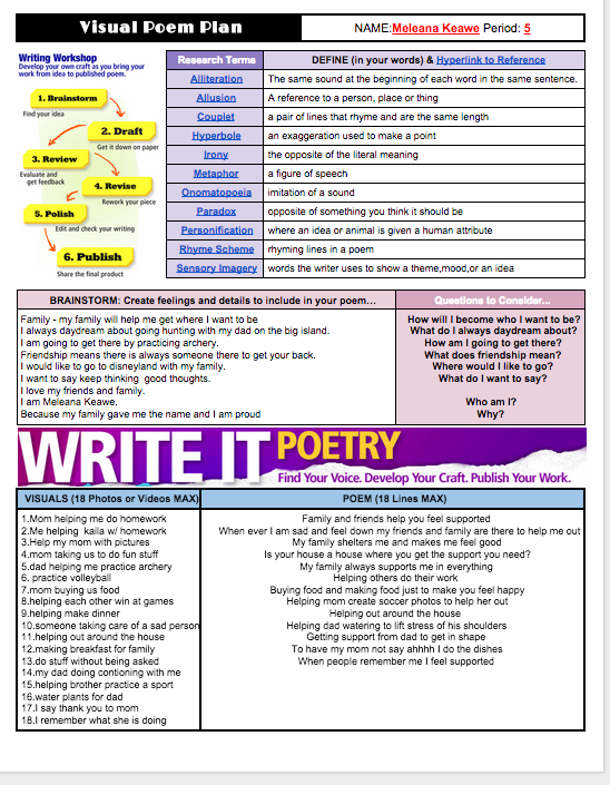
    The next project after our Hiki No project was to create a poem by ourself. My poem was on being supported by family and friends. Visuals make an impact because if you just here the voice you can't make a picture out of what they are saying. I chose being supported because it is great and that if you make mistakes you have people to be there to help you back up once made that mistake because we aren't perfect. Visuals also help create an impact because the voice is just to help make you want to listen.

    Special effects help affect the overall meaning because if you have a sad or depressed poem you can add shadows to make it feel darker. If you have a happy jumpy poem you can sparkles and happy stuff to enlighten your poem.I didn't really use many effects because I just started this program this year but I know next year my poem will be way better and have a lot more effects and transitions. I think that because of effects and transitions our poems can be really good but still have a few flaws.I know that because of effects you can have moods and tones in your poem.

    So I am not very happy with how it turned out because I messed up at the beginning and the end.I could make it better by writing something instead of just leaving it there. I could also fix it by putting in a picture a the end so you don't see a building. I also should have made one of the descriptions shorter so it didn't mess up the other part. I know that because I didn't fix this my grade might go down and I guess that what my teachers told me is true. They told me " What you get is what you EARNED " I guess at first I didn't this but now I totally get and respect it.